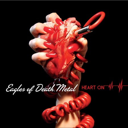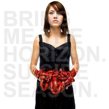


All of my artwork will be hand drawn using drawing software on my laptop and such all the gore will be fake for obvious reasons. I feel that with my genre, I could either go down the Satanic shock route as bands such as Slayer have, the modern plain shock route as Marilyn Manson did with their album Mechanical Animals, or the disturbing, suffering route as the albums above have. I decided to go with the latter as it will be shocking, which is what my band would aim for, and it fits with the horror theme that my video is taking.


I was also inspired by the artwork, 'The Butcher Boys' by Jane Alexander which shows demon like humanoids, that have no mouths or eyes and appear to be malformed and disfigured. I would like to try and incorporate some of this design into my digipack artwork.


No comments:
Post a Comment