Wednesday 19 December 2012
Evaluation Question 3 Possible Idea
This is my idea for my final version of my Evaluation Question 3, but I am not sure if this is the version I will go for as my final copy. I may attempt to create another 'TV Commercial' type video using MoviePlus, rather than the more simple Animoto format I have used here. I'll think about it over the next few days.
Tuesday 18 December 2012
Evaluation Question 4 (Draft)
How did you use media technologies in the construction and research,
planning, and evaluation stages?
Media is known for being
very technologically centered and it was obvious from the beginning that a wide
array of different technologies would be needed to create, research, plan, and
evaluate our music videos and ancillary texts. I have tried to use as many
different technologies throughout my work, to create variation and to
experiment with how different pieces of technology could help me to achieve
what I wanted with my video and ancillary texts. Below, I have stated each
piece of technology I have used in this project.
Websites
Blogger was a vital part of
my project, enabling me to keep all of my work organized, and in one central
spot. I have used blogger as a main hub for all of my work throughout the
research, planning, construction, and evaluation stages of my project, and with
Blogger’s labelling system, it means that I can see any of the work I have
done, incredibly quickly. The posting system is also very useful, as it lets me
post my thoughts and ideas, alongside my work, as I go along.
YouTube, the most popular
video sharing website in the world, has also been a very useful tool for my
project. Using it, I have been able to upload all of the videos I have created
for my project, including the final music video, and all of the drafts before
it. I have then been able to embed my YouTube videos onto my blog to keep them
all in the same place as the rest of my work. The commenting system on YouTube
has also been a lot of help, letting people view my video and drafts, and then
comment their views and ideas straight onto the video, letting me get what
people think at real time.
Animoto is a quick, and easy
to use video creation website. On it you can easily put together quick,
presentation style videos, using pictures, text, and music. It is slightly
restrictive, as it follows several set themes, and has little room for any real
editing, but as a quick presentation creator, it has been a lot of use. I have
used Animoto for my pitch video, and for the final evaluation question three.
I have also used social
networking site, Twitter, in my project. I created an ‘official’ twitter page
for my fictional band to give them some character, and to create more realism.
On it, my band can make announcements and talk directly to their fans. It is
also a good way for me to get feedback on my work from people who follow my own
twitter account.
Facebook, another social
networking website, has been used primarily for feedback purposes. On it, I
have posted my final video to allow my friends to watch it and feedback their
views on it, to me.
Yahoo Mail has been my main
email site for this project, allowing me to send my work home from the school
PCs if I need to work on it anymore.
Research & Planning
Google/Google Images (www.google.co.uk)
Google was the primary
search engine I used during the research and planning stage of my project. It
allowed me to access millions of websites and billions of pictures across the
internet, which gave me a grand scope to take my research from.
Samsung Galaxy Ace GT-S5830
I used my android phone, the
Samsung Galaxy Ace GT-S5830, several times in the process of creating my video.
All of my location test shots were taken with the phone’s 5 megapixel camera. I
also used it to take photos for the band’s twitter page. Another thing I used
the phone for was to arrange the filming days with everybody, using its calling
and texting features.
Microsoft Word 2010
The definite choice for word
processing software, I used Microsoft Word 2010 for any writing I needed to do
for my blog. It allowed me to plan out what I had to do, create bulletproof
lists of what a certain piece should include, write these very evaluation
questions, etc. It is an extremely useful piece of software, and I think most
of the work I now do would be lost without it.
Windows Movie Maker
I used this limited, but
simple piece of video editing software early on in my project to put together a
short animatic. Although troublesome to use, this software did the job
reasonably well, though I know it was definitely below par for my final pieces.
Production
Panasonic HD Camera
The camera I choose to film
with for this project was a Panasonic HD Camera. It was versatile and handheld,
allowing me to take it through the woody locations without any difficulty. It
was also extremely easy to use and set up, which gave me the option of
spontaneous ideas and filming certain ideas as they arrived. The HD capabilities
meant that the video quality would be high as well.
SanDisk 8 GB SD Card
I saved all of my film
footage onto a SanDisk 8 GB SD Card. I felt that I wouldn’t need over 8 GB of
memory for my filming, so didn’t see any reason to pay more for a card with
greater memory. The SD reader on my laptop allowed me to easily transfer all of
my footage straight from the SD card to my editing software.
Adobe Photoshop CS2
Despite being a slightly
older version of Photoshop, this is the version I used on my laptop to create
my digipack, advert, and to draw all of the artwork that was used in my
digipack. It enabled me to easily put together the layouts for all of my
ancillary work, and in addition with the touchscreen laptop, it made drawing
the artwork surprisingly easy.
Post Production
HP TouchSmart tx2
This is the laptop/tablet I
used for the majority of my project. It features a touchscreen which can be
swivelled around and place down like a tablet if it is to be used purely as a
tablet. It can also be operated as a normal laptop however, featuring the usual
keyboard and screen set up if desired. I found the touchscreen extremely useful
when it came to drawing the art for my digipack. The ability to use the built
in pen to draw straight onto the screen was perfect for what I needed to do.
College PCs and College Apple Macs
I used the college PCs and
Apple Macs throughout my project to upload different pieces onto my blog, or to
add new blog posts.
AVS Video Editor Trial Edition
I tried out the free trial
edition of AVS Video Editor for the first draft of my music video. I found that
although easy to use, this piece of software did not provide the quality of
video that I required for my final piece.
Serif MoviePlus X5
For the editing of my final
music video, after trying out several different pieces of software, I settled
on the less-widely known Serif MoviePlus X5. I found this software very easy to
pick up and use, whilst still giving me all the features I needed, one of the
most important being the ability to lower the brightness and saturation of the
clips I was using. It was also extremely easy to export my video from the
software to a DVD and onto YouTube, which was a bonus.
Evaluation Question 3 (Draft)
Feedback has been a vital
piece of coursework, allowing me to improve and fix my pieces at every stage of
production. It’s the main part of evolving and improving a product. Finding out
what your market feels about you piece is a useful way to work out what is good
about it and what needs to be improved. During my project, I have received
various pieces of audience feedback at many different stages. Without the
feedback, I would never have realised the major things that needed changing in
my first draft, such as the need to put the monster in the background more and
not show it properly at any point, maintaining the suspense that I lost too
early in the first draft. The following is the main feedback I received on my
piece:
"Video fits in with the genre well. Quite
scary at times, but I suppose that's what you want it to be like,
and it suits the genre very well. The actors are really good. I like
the theme of little red riding hood also; it's different. When you do the
singing with the face paint, it suits the genre really good and the lip syncing
is good. Well done man." Vishal Kumar
"Excellent use of mise en scene and well thought-out location. Effective lighting and accurate lip syncing. Good use of contrasting colours with the girl's little red riding hood type appearance.
Good editing of shots, which creates suspense and maintains interest all the way through." Ben Scott
"Narrative works well with the shots. The parallel editing is effective is a lot of shots. Lighting works well the dark genre. Well done :)" Sian Lynes
"The narrative works really well with the video and the whole concept is very effective. If anything, maybe making some shots lighter would of been better to be able to see things in more detail." Laura Ward
"The narrative is by far the most effective aspect of the video; it is believable as it feels very much like you are watching a story. Good use of filters and effects; adds to the creepy atmosphere.
Costume/makeup choices fit well with the theme of the video, and the syncing of the guitars and singing to the music is very accurate. The only criticism I can make is that some shots are a little too dark, particularly the shots of 'Manson' singing. Well done, though." Martyn Hollinshead
"The narrative is really well thought out and generally scares us, which is what we presume you intended. Your costume and make-up is really well done and you look the part. The effects/editing in the video is very effective and advance. If there was one thing to improve on, then it would maybe be the lighting on the main singers face, because it was hard at times to see the lip-syncing." Mattie White & Steph Law
"Good narrative and good costume. Maybe the end could have been scarier as it built up to just her eyes being closed. Makeup and transition are very effective." Mae Burton & Laura Barsby
The song and genre I chose
to use for my music video is not a particularly popular one in modern society,
with metal and Marilyn Manson falling more on the boundaries of youth culture.
This came as a sort of blessing in disguise, as it meant that all of my
feedback would be mostly unbiased and based around the video itself, rather
than a love for the music being used. There was still the chance that someone
would give negative feedback based around not liking the genre or song, but
this was highly unlikely to happen given the lesser known song I used. The
feedback that affected my choices the most however, was what I received after
my I made my first draft. This was highly influential over my decision making
process as it was the major crossroads in the project, in which I could have
gone in many different directions. I feel my first draft was not up to scratch
but feedback from it gave me the means to get it to the stage that it is today,
what I consider a big step. This included the idea of using a little bit more
of the singing and guitar sections in the video, to attempt to improve the
overall acting, and to hide the creature more and to never show it fully, as
this ruined the suspense and horror of the situation. This feedback also
confirmed that the strongest point of my video was the narrative I was
attempting to create through it, and that this was the point I should put focus
on.
Monday 17 December 2012
Evaluation Question 2 (Draft)
How effective Is The Combination Of Your Main Product And Ancillary
Texts?
For a musician to market a song or album well, everything has to connect, forming a campaign. The album artwork, advertisements, and music videos all have to follow the same line of thought and themes. I have tried to emulate this in my final pieces as much as I can, although occasionally I have forgone this for certain features.
For a musician to market a song or album well, everything has to connect, forming a campaign. The album artwork, advertisements, and music videos all have to follow the same line of thought and themes. I have tried to emulate this in my final pieces as much as I can, although occasionally I have forgone this for certain features.
I feel the two pieces of my campaign that connect together the most successfully are my digipack artwork and my advertisement. I made sure that both feature the same kind of imagery, although I was going to base my advert on the inverted crucifixion image inside of my digipack, until I realised that this was too in your face and that something more subtle would suffice. I then chose to take the image most people would see when they thought of the album, the front cover, and then base my advert around that. By showing the entire body of the image from the cover, I feel that I have successfully connected the two texts together into a campaign, whilst still creating a difference between them. It would have been far easier to have just used the exact image from the front cover, but I felt that this would be a cop-out and ineffective as a campaign.
My video is a little bit more different and hasn’t got as strong connections as the ancillary pieces do, but I feel it still connects well as part of a campaign. As the music video is not the only song on the album, its connection isn’t 100%, as it doesn’t copy the artwork themes. It is still however, based around that strong theme of horror that is seen in the artwork adorning the digipack and advert. I felt like this was the most important feature for me to get across in all of my pieces; that scary, fear-inducing imagery. I also chose not to use any photographs in my digipack, preferring to go for purely illustrations. I feel this is reflective of my genre, heavy metal, and that photos of the band would have dampened the horror ideas I was trying to get across. Because of this, I lost a major link between my ancillary texts and my video, as none of the band members featured in the video are shown anywhere in any of the rest of the campaign texts. As I didn’t have this major connection, I had to try and keep the campaign idea between the different pieces, in other ways.
Another difference between my ancillary texts and my video was the absence of any gore in my video. The artwork in my digipack, especially the crucifixion image, was quite gory, however, I felt this wasn’t needed in my video. I wanted my video to go for a more psychological idea of horror, in the vein of Marilyn Manson, rather than a bloody one, as shown in some of my digipack. This means that the two pieces do contrast slightly when seen together, but I feel still form a successful campaign.
Finally, I used a great deal of desaturation and darkness on both my video and ancillary pieces, to create an essence of horror. This means that both pieces fit together, due to their similar colour schemes of dark grey and black. I felt that putting a lot of my video in the shadows, helped to boost the fear factor of it, and then this meant that darkening the digipack artwork combined the two pieces into one campaign, and continued the general theme of darkness and horror throughout.
Sunday 16 December 2012
Evaluation Question 1 (Draft)
In What Ways Does Your Media Product Use, Develop Or Challenge Forms And
Conventions Of Real Media Products?
For my video, digipack, and
magazine advert, I realised that I would have to follow many of the conventions
of the metal genre. Heavy metal is a very visual genre of music, relying
greatly on a set of preconceived forms and ideas. If my video was to succeed
and fit the role I wanted it to, it would have to stick to these conventions
pretty well, although some developing or challenging of the conventions would
make it stand out from the rest. The main artists I chose to base my work on
were shock metal bands like Marilyn Manson and Rob Zombie. These bands focus
greatly on horror and controversial imagery, sometimes being very anti-religion
and anti-society. I have tried to keep this with my project, especially in the
digipack and advert campaign, using several horror-based drawings to keep my
work following the conventions. My video also contains a horror theme,
primarily in the hooded figure stalking the girl throughout it. Marilyn Manson
is usually more subtle during his music videos and doesn’t usually follow a
strong narrative, although I felt this was the route I wanted to go down,
rather than just random gothic images.
I
turned the darkness and saturation down on most of the shots in my video and on
my digipack and advert images. This fits with the metal genre well, as they
prefer to go for a darker, more twisted, and fiercer view of reality than other
music genres do. I made sure that the girl in the video was wearing a bright
red coat, as not only did this link it with fairytales like Red Riding Hood,
but it also stood out even more once everything around it in the shot had its
saturation turned down. The red stands out beautifully against the greyscale
surroundings, giving connotations of danger, as red can signify this
pragmatically.
The location my video
was shot it was some woods around my local area. Dark woods have been used
several times in metal videos, so I felt like I was sticking a convention of
the genre by using a location like this. Metal videos that are set in woods
include the video for ‘The Animal’ by
Disturbed, ‘Curl of the Burl’ by
Mastodon, and ‘The Amity Affliction’
by Chasing Ghosts. The foreboding forest could be said to be a cliché, but I
felt like it was the only location where my narrative would make sense. Using
that sense of nowhere to run, and obscured vision, that a forest creates.
The artwork used in my digipack and on my advert follow strong rules of heavy metal conventions. Metal artwork is known for being hand drawn illustrations, usually portraying fantasy scenes or monsters, as mine does. I have gone for a more horror theme, as stated before, so have tried to connect the generic metal artwork with the themes that bands like Marilyn Manson and Rob Zombie use in their work. Also, the image of a man on an upside crucifix plays on two conventions of metal. The first is the controversial anti-religion and anti-Christian imagery that Marilyn Manson in particular uses. One of his most controversial albums, ‘Holy Wood (In the Shadow of the Valley of Death)’ features a similar picture, of Manson himself on the cross. The other feature found within many heavy metal albums and songs, is the strong Satanic or quasi-satanic theme that they utilise. The fact that the image shows a man on an inverted cross links to Satanism, as this is one of the signs attributed to it.
The artwork used in my digipack and on my advert follow strong rules of heavy metal conventions. Metal artwork is known for being hand drawn illustrations, usually portraying fantasy scenes or monsters, as mine does. I have gone for a more horror theme, as stated before, so have tried to connect the generic metal artwork with the themes that bands like Marilyn Manson and Rob Zombie use in their work. Also, the image of a man on an upside crucifix plays on two conventions of metal. The first is the controversial anti-religion and anti-Christian imagery that Marilyn Manson in particular uses. One of his most controversial albums, ‘Holy Wood (In the Shadow of the Valley of Death)’ features a similar picture, of Manson himself on the cross. The other feature found within many heavy metal albums and songs, is the strong Satanic or quasi-satanic theme that they utilise. The fact that the image shows a man on an inverted cross links to Satanism, as this is one of the signs attributed to it.
Wednesday 12 December 2012
Final Music Video Feedback
Once again, feedback is incredibly useful for any piece of work. Even though I have now made all the changes I will to my video, and have created a final version, I still feel that class feedback is useful. So for the second time, I have let my classmates watch my video and feedback and thoughts they have on it.
"Video fits in with the genre well. Quite scary at times, but I suppose that's what you want it to be like, and it suits the genre very well. The actors are really good. I like the theme of little red riding hood also; it's different. When you do the singing with the face paint, it suits the genre really good and the lip syncing is good. Well done man." Vishal Kumar
"Excellent use of mise en scene and well thought-out location. Effective lighting and accurate lip syncing. Good use of contrasting colours with the girl's little red riding hood type appearance.
Good editing of shots, which creates suspense and maintains interest all the way through." Ben Scott
"Narrative works well with the shots. The parallel editing is effective is a lot of shots. Lighting works well the dark genre. Well done :)" Sian Lynes
"The narrative works really well with the video and the whole concept is very effective. If anything, maybe making some shots lighter would of been better to be able to see things in more detail." Laura Ward
"The narrative is by far the most effective aspect of the video; it is believable as it feels very much like you are watching a story. Good use of filters and effects; adds to the creepy atmosphere.
Costume/makeup choices fit well with the theme of the video, and the syncing of the guitars and singing to the music is very accurate. The only criticism I can make is that some shots are a little too dark, particularly the shots of 'Manson' singing. Well done, though." Martyn Hollinshead
"The narrative is really well thought out and generally scares us, which is what we presume you intended. Your costume and make-up is really well done and you look the part. The effects/editing in the video is very effective and advance. If there was one thing to improve on, then it would maybe be the lighting on the main singers face, because it was hard at times to see the lip-syncing." Mattie White & Steph Law
"Good narrative and good costume. Maybe the end could have been scarier as it built up to just her eyes being closed. Makeup and transition are very effective." Mae Burton & Laura Barsby
I am very happy with all of the feedback that I have rcieved from my final video, and I feel that I have improved it tenfold from the first draft a few weeks ago. The one criticism people picked up on was the lighting being too dark in some shots. I appreciate this, and probably did have it a little bit too dark, but it was a design choice in an attempt to create the right atmosphere. The other interesting point that Mae and Laura brought up, was their view that the end of the video, where the girl "dies", was too anticlamtic and that something more excited should of happened. Again, I chose this ending for a reason, as I wanted it to be subtle and contrast the gore of my digipack slightly. I feel however, that both criticisms are valid, and I would definitely consider changing a few things if I went back to do it again.
Thursday 29 November 2012
Make Up Inspiration
In my video, I want to get the mise en scene spot on. I need it to be influenced by Marilyn Manson as much as possible, so I have had to think carefully about the costume and make up I'm going to use. The most important part of anything Marilyn Manson does is the make up he wears. Because of this, I have to ensure that the make up my lead singer wears in my video, is based upon or fits in with the make up style Manson wears. Below I have created a gallery of some of the make up Marilyn Manson has worn over the years.


Wednesday 7 November 2012
Refilming
Having observed the failings of my first draft, I have decided to refilm my music video once again. I now know what I want to achieve with my video, and how to achieve it. One major flaw I think my draft had, was the poor editing software, AVS Video Editor, which I have now replaced with the more advanced, Serif MoviePlus 5.0. It isn't a very wellknown editing software, but I feel it will achieve what I need with my video. I have also managed to aquire a guitar to use in my reshoot, which will allow me to film my original ideas for the guitar solo, involving someone actually playing a guitar...during the solo...a moment of genius, I must admit. I couldn't do this in my draft, as I didn't have access to an electric guitar at the time of filming. Finally, due to the tight schedule I have to stick by, my original lead actress cannot film on the day I need to, so I have had to replace her with another girl. I feel this may be an improvement, as my new girl, Abbie, has experience in stage performing. We'll just have to see how it all works out. I'm planning to film this sunday.
Monday 5 November 2012
Music Video First Draft Feedback
Feedback on my first video draft is essential to allow me to evolve the idea and improve it. Because of this, I let the other students in my class have a look at my first draft, and then feedback to me after they had seen it. From this I gathered the following points:
Positive
Positive
- My main actress fits the role really well.
- The beginning works well.
- Costume all works for genre.
- Mise en Scene fits genre and music.
- Wood setting in particular works well with theme.
- Dull colours, lightning, and desaturation are add to the creepiness.
- Strong narrative and ideas.
Negative
- Not enough different locations.
- Lip syncing needs to be clearer.
- Costume on creature isn't good enough.
- Singing sections don't work well with the rest of the video, using too many effects compared to the rest.
- Some sections are too plain and uneventful.
- Bit slow for song.
- Acting looks unrealistic and fake at times.
This feedback has given me a lot to think about and I now know that my video needs a lot of work. I think another problem with the first draft, that no-one else mentioned, was that the creature is too visible, too early. It ruins any suspense and defeats the idea I had in my mind. Because of all the negative points I have received, I have decided that the best option is to refilm again. I will hopefully be doing this sometime this week.
Wednesday 31 October 2012
Music Video First Draft
Ignore the watermark and slightly low quality; I'll be using the full version for my final piece. I am also planning to re-film several of the scenes involving the girl, to make them seem more natural and panicked. I am also going to cut back on the amount of screen time the creature gets, as I want to shroud it more in mystery and retain some scary elements. Also, the guitar solo in the middle needs to be filled out with more quick shots of random, unsettling images. This is very Manson and I think it will give the video a strange, disturbing feel.
Friday 19 October 2012

Album Digipack, First Draft

Monday 15 October 2012
Record Label
I have chosen to make Interscope Records the record label Danse Macabre are under. They are a major label in America, having signed acts like Blink-182, Papa Roach, Rise Against, and Van Halen. They were also the label for Nine Inch Nails and Marilyn Manson at one point, producing seven of Manson's eight albums. Obviously, this means they're a great label to sign my band who are predominantly based on Marilyn Manson.
Inspirational Pictures For My Digipack

This image was the inspiration for my digipack cover. I loved the exposed muscles and bones, and the way the string hooked in his arm held it up.

This image gave me the idea for a face that had no eyes, which will also be used on my digipack cover. I like the jester theme as well, but don't think it would work for my ideas.

This image put with the artwork, 'The Butcher Boys' gave me the idea for the face trying to scream without a mouth. I will use a similiar design inside of my digipack.

This classic image of the Dance of Death, after which my band got their name, inspired me for another image I will use in my digipack. I plan to create a picture of some skeletal type figures dancing in the moonlight. Simple, but it links to my band well.
Friday 12 October 2012
Second Piece of Digipack Art
This is the second piece of art I have drawn for my album digipack. It will appear under the front cover so it is staring right at the person as they open it. This image was inspired by a piece of artwork called 'The Butcher Boys' by Jane Alexander. I have always liked the look of this sculpture, showing three demonic humanoids sitting on a bench, and I decided to use some of it's imagery inside my album, though it is once again, hand drawn by myself.


Monday 8 October 2012
First Piece of Digipack Art
This is the first picture I will use in my digipack art. I have hand drawn this myself using Photoshop CS2 and this is the method I will use for all of the art in my digipack. It will feature inside the actual digipack instead of on the front or back of the cover, as I recognize that it is a controversial image and so must be hidden slightly, inside of the packaging. The other images I am planning to draw are a lot tamer in comparison.


Wednesday 3 October 2012
Controversy
One of the images I am planning to use is quite controversial as it shows a man with broken legs crucified on an upside down cross. Obviously this contains a very macabre and disturbing theme and could also be controversial within the Christian community for the use of the cross. I use the upside down cross as a tounge-in-cheek reference to Satanism which heavy metal is often connected to and mean it as its original use which was an Ancient Roman torture device rather than a Christian symbol. I will also create a 'clean' version of this image minus the gore so as to create the option for my artist's album to be sold in mainstream shops.
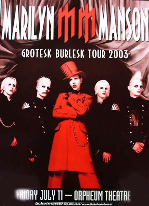
The artist that my band is based on is Marilyn Manson who is well known for his shocking actions and images and that's why I am using images like this in my album art. Below are some of Manson's controversial images to show that my ideas fall within my genre conventions and aren't just pointless blood and guts.


The artist that my band is based on is Marilyn Manson who is well known for his shocking actions and images and that's why I am using images like this in my album art. Below are some of Manson's controversial images to show that my ideas fall within my genre conventions and aren't just pointless blood and guts.

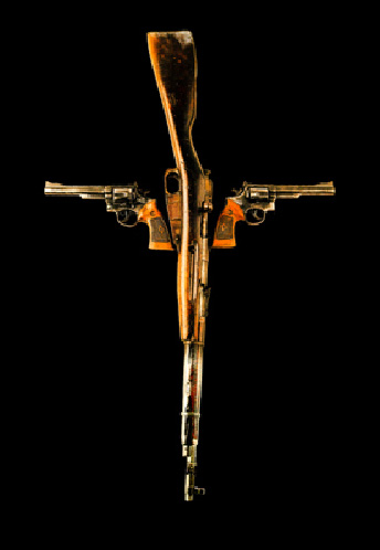

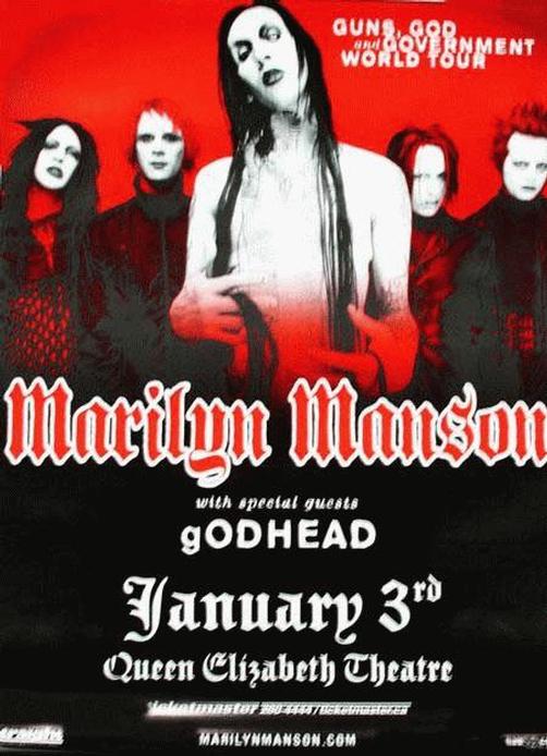
The use of the cross symbol in these images caused controversy among the Christian community, especially the Holy Wood album art which showed a representation of Manson as the crucified Christ, and the logo for their 'Guns, God, and Government' Tour which featured a cross made up of guns.
The Antichrist Superstar album by the band also caused controversy due to its content and Manson's declaration that he was the Antichrist. The images throughout the album are also quite grotesque and disturbing.
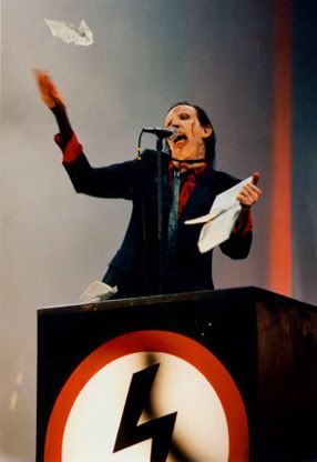
During live performances of the song Antichrist Superstar from the album of the same name, Manson performs from a fascist style podium with a swatstika-like lightning symbol on it. This is supposed to represent the fascism of the modern media and Christian society and is made even more controversial by the Bible ripping that he performs as he sings.
Their album Mechanical Animals also created controversy due to Manson's costume during a lot of the songs featured on it. Trying to represent an alien type lifeform, he wore a full body suit which gave him breasts and covered up his genetalia completely. This shocking look caused much controversy in America and many shops refused to sell the album without a sticker covering the artwork.
A lot of Marilyn Manson's image is based around shocking images and themes and I am trying to incorporate this into my album art with the controversial images, although I will create 'clean' and 'dirty' versions of each to avoid issues.


Tuesday 2 October 2012
Album Art Explanation
I have decided that the artwork for my digipack will be quite grotesque and disturbing in its design. I have decided to do this as my genre, heavy metal likes to play on the morbid and bloody themes that shock modern society. It will tell people what the album contains straight from the get go, even if the particular song I am using is slightly softer by metal standards, going more for a creepy vibe. Below are some heavy metal album covers that go for a blood and guts design:

All of my artwork will be hand drawn using drawing software on my laptop and such all the gore will be fake for obvious reasons. I feel that with my genre, I could either go down the Satanic shock route as bands such as Slayer have, the modern plain shock route as Marilyn Manson did with their album Mechanical Animals, or the disturbing, suffering route as the albums above have. I decided to go with the latter as it will be shocking, which is what my band would aim for, and it fits with the horror theme that my video is taking.


All of my artwork will be hand drawn using drawing software on my laptop and such all the gore will be fake for obvious reasons. I feel that with my genre, I could either go down the Satanic shock route as bands such as Slayer have, the modern plain shock route as Marilyn Manson did with their album Mechanical Animals, or the disturbing, suffering route as the albums above have. I decided to go with the latter as it will be shocking, which is what my band would aim for, and it fits with the horror theme that my video is taking.
I was also inspired by the artwork, 'The Butcher Boys' by Jane Alexander which shows demon like humanoids, that have no mouths or eyes and appear to be malformed and disfigured. I would like to try and incorporate some of this design into my digipack artwork.
Subscribe to:
Posts (Atom)